Zebrra: A Standout Display Font for Digital Branding
It started with a hero section—just me, Figma, and a client’s new coaching website. The mood board called for “modern but warm,” “confident but approachable,” and “visually memorable without being distracting.” I’d already tried three clean sans serifs and two elegant serifs, but none quite landed the emotional tone. Then I remembered Zebrra: that bold, beautifully balanced display font from Apostrophic Labs I’d downloaded from their Freebies collection months ago and hadn’t yet tested in production. I dropped it into the headline—“Clarity Begins Here”—and instantly felt the shift. Not just visual, but *intentional*. Like the design finally exhaled.
What Makes Zebrra Shine on Screen
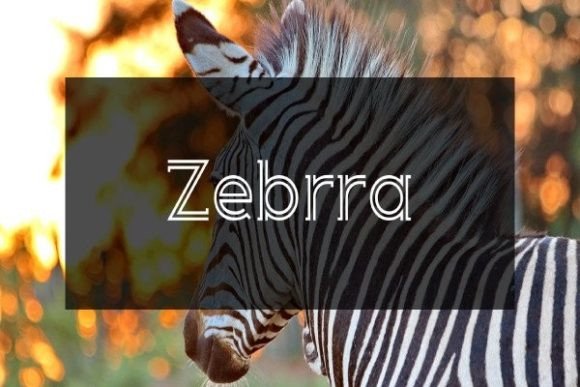
Zebrra is unmistakably a display font—designed not for paragraphs, but for presence. Its letterforms carry confident geometry with subtle organic warmth: tall x-height, generous spacing, crisp terminals, and a rhythm that feels both contemporary and quietly timeless. It’s not flashy or gimmicky—it doesn’t rely on swashes or exaggerated contrast to stand out. Instead, it earns attention through clarity, consistency, and quiet confidence. On a high-resolution laptop screen, it reads like a premium typeface; on mobile, it holds its weight beautifully at 48px and above—no blurring, no awkward kerning gaps, no pixelation.
I tested it across real layout scenarios: as a primary headline over a soft-gradient image banner (works flawlessly with light text color and subtle drop shadow), as a section title in a course sales page (paired with Inter for body copy), and even as a stylized CTA button label (“Start Your Journey”). In every case, Zebrra elevated the perceived professionalism of the page—not by shouting, but by anchoring the message with visual authority.
Where Zebrra Fits—and Where It Doesn’t—in Web Design
This isn’t a font for everything—and that’s exactly why it works so well where it does. I used Zebrra exclusively for hero headlines, major section headings, logo lockups, and branded graphic elements (like quote cards or testimonial banners). Its strong silhouette makes it ideal for fast-scanning layouts: users landing on a page grasp hierarchy in under two seconds because Zebrra says “this is the main idea” without needing explanation.
But I didn’t use it for navigation menus, form labels, paragraph text, or small footer links—and for good reason. Its decorative character and moderate stroke contrast reduce legibility below ~24px, especially on lower-DPI screens or in dense UI contexts. Accessibility testing confirmed it’s best reserved for large, short, high-impact text. For anything requiring sustained reading or precise interaction cues, I paired it with a neutral, highly legible sans serif—Inter, Manrope, or even system fonts like -apple-system—ensuring WCAG AA contrast compliance and responsive scaling.
Practical Testing Across Real Projects
In a recent boutique online store redesign, I applied Zebrra to category banners (“Handcrafted Ceramics”, “Small-Batch Skincare”) and product feature headlines. The effect was immediate: the shop felt more intentional, less generic. Customers weren’t just browsing—they were stepping into a curated experience. On a portfolio homepage, I used Zebrra for the name in the masthead and paired it with a delicate serif (Cormorant Garamond) for project subtitles—creating elegant contrast without visual competition.
For a digital brand kit I built for a wellness coach, I set Zebrra as the primary display font across all web assets—landing pages, email headers, and social media cover graphics. Its consistent rhythm helped unify the brand across touchpoints. And yes—I checked the file formats: the Fonts package included WOFF2 (ideal for web loading), OTF, and TTF. No SVG fonts needed, no custom hosting headaches. Licensing is clear: free for personal and commercial use, including client websites and SaaS dashboards—no attribution required.
Smart Pairing and Responsive Considerations
Font pairing is where Zebrra truly reveals its versatility. Its strong personality means it thrives alongside minimalist companions. I’ve found success pairing it with:
- Inter or Manrope for body copy, forms, and interface text—clean, neutral, and highly readable at any size;
- Cormorant Garamond or Playfair Display for editorial accents or subtitle treatments—adding typographic depth without clutter;
- A single handwritten script (used sparingly!) for signature lines or callout quotes—creating warmth and human texture.
On mobile, I always test line height and letter spacing. With Zebrra, I increased tracking by +20–30 units at smaller viewport sizes to prevent letters from feeling cramped. And crucially—I verified fallback behavior: defining font-family: 'Zebrra', -apple-system, BlinkMacSystemFont, 'Segoe UI', sans-serif; ensured graceful degradation if the font failed to load.
Final Notes Before You Implement
Before dropping Zebrra into your next project, take a moment to review what’s included. The Freebies version offers one weight (Regular) and standard Latin character support—perfect for English-language sites, but double-check multilingual needs if you serve broader audiences. There are no stylistic alternates or ligatures in this release, which keeps things simple and predictable—ideal for fast-turnaround branding.
Most importantly: Zebrra isn’t about decoration. It’s about intentionality. When you choose it, you’re saying, “This headline matters. This message deserves to be seen—and remembered.” That kind of clarity is rare. And when it’s backed by solid web performance, thoughtful pairing, and honest licensing? That’s not just a great display font. That’s a reliable design ally.