Vortex: A Bold Display Font That Anchors Digital Branding
It started with a hero section—just me, a half-finished coaching website mockup, and that familiar moment where the headline feels *almost* right… but not quite. I’d tried three clean sans serifs, two editorial serifs, even a subtle script—but nothing gave the visual weight and personality the brand needed. Then I dropped Vortex into the H1 field. Instantly, the layout clicked. Not because it was louder, but because it was anchored: squared, bold, playful yet intentional—like a confident handshake in type form.
What Vortex Brings to the Screen (Beyond Just “Cool”)
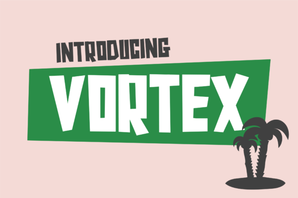
Vortex is a display font—designed for impact, not endurance. Its squared letterforms give it structural clarity, while its generous weight and open counters ensure legibility even at smaller display sizes. It’s not minimalist, but it’s not chaotic either. There’s rhythm in the uniform stroke width, warmth in the slightly rounded corners, and just enough quirk in the uppercase ‘R’ and ‘G’ to feel human—not robotic. As a web designer, I appreciate how it bridges personality and professionalism without tipping into novelty territory.
I tested Vortex across real contexts: a boutique online store’s seasonal banner, a course sales page CTA button, a portfolio site’s project title cards, and a blog’s featured post header. In every case, it elevated hierarchy without competing with content. On mobile previews, it held up beautifully—even at 32px on a narrow viewport—thanks to its strong x-height and generous spacing.
Where Vortex Shines (and Where It Steps Back)
Vortex excels where you need immediate recognition and emotional resonance:
- Hero headlines — Paired with a neutral sans serif like Inter or Open Sans, it creates instant contrast and focus.
- Section dividers — “Our Process,” “Join the Workshop,” “Limited Edition”—short phrases that benefit from its bold presence.
- CTA buttons — Especially on image overlays or gradient backgrounds, its squared forms render crisply at any size.
- Branded digital assets — Think downloadable brand kits, social media cover graphics, or email header banners where tone matters as much as text.
That said, Vortex isn’t built for long-form reading. I tested it as body copy on a landing page—and while it looked striking for a sentence or two, scanning fatigue set in quickly. It’s also not ideal for navigation menus, form labels, or small interface elements like tooltip text. Its strength lies in brevity and intention: one word, one phrase, one moment of emphasis.
Pairing Vortex Thoughtfully (No Guesswork Needed)
Good pairing isn’t about contrast for contrast’s sake—it’s about balance that serves the user. With Vortex, I consistently reached for highly legible, low-contrast sans serifs: Inter, Poppins, or even system fonts like -apple-system for fast-loading contexts. Their clean neutrality lets Vortex lead without shouting over supporting text.
For more editorial or lifestyle brands, I paired Vortex with a warm, relaxed serif like Lora or Playfair Display—especially in blog headers or campaign landing pages where voice and authority matter. The key? Let Vortex handle the energy; let the secondary font handle the clarity.
Practical Web Considerations Before You Implement
Before dropping Vortex into production, I checked three things:
- Webfont support — Does it come with WOFF2 files? Yes—lightweight and widely supported.
- Weight options — Vortex includes a single bold weight (ideal for display), plus optional alternates and ligatures. No light or medium variants—so don’t expect typographic nuance within the family itself.
- Licensing & multilingual needs — The commercial license covers websites, SaaS dashboards, and client projects. Basic Latin characters are fully covered; extended language support (e.g., Central/Eastern European) depends on the version purchased—always verify before launching globally.
I also ran quick performance checks: font loading was snappy, and fallbacks (declared in CSS) behaved gracefully during load. For accessibility, I ensured all Vortex-styled headings had proper semantic HTML structure and sufficient color contrast—especially over textured or image-based backgrounds.
Real-World Layout Wins You’ll Notice Fast
On a recent product landing page for a creative toolkit, swapping the default heading font for Vortex tightened the perceived value instantly. Customers scrolled slower through the hero section—not because it loaded slower, but because the typography invited pause. On a coaching site’s “About” page, using Vortex only for the founder’s name and tagline created visual breathing room and reinforced personal branding.
Even in dark mode, Vortex retained its character—no unintended thinning or pixelation. And because its letterforms are so distinct, it scaled cleanly across responsive breakpoints: no awkward reflow, no clipped edges on buttons, no blurry rendering on high-DPI screens.
If you’re choosing a display font to carry your digital brand’s first impression—whether for a portfolio, shop, course, or campaign—Vortex delivers more than style. It delivers confidence, clarity, and quiet authority. It doesn’t try to be everything. It simply does its job, boldly and well.