Roman Shine: A Display Font That Commands Attention
It was 3 p.m. on a Tuesday—two days before the launch of our client’s new online course series—and I was tweaking the YouTube thumbnail for the first episode. The headline needed to pop in under two seconds, even when shrunk to mobile preview size. I cycled through three fonts. Then I dropped in Roman Shine. Instantly, the title landed with weight and intention—not loud, not gimmicky, but unmistakably *there*. That’s when it clicked: Roman Shine isn’t just another display font. It’s a visual anchor for campaigns that need clarity, confidence, and quiet authority.
What Roman Shine Actually Feels Like in Motion
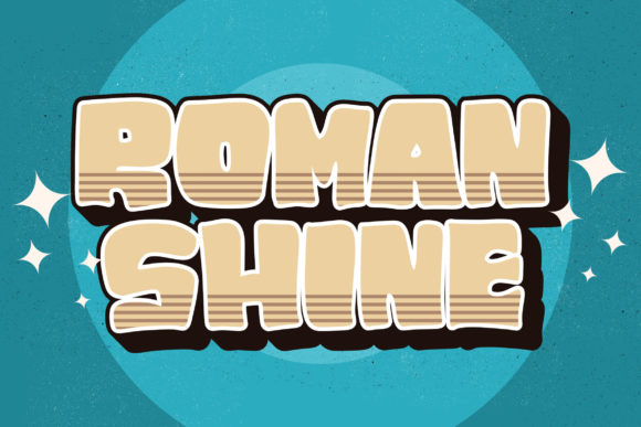
Roman Shine is a thick, modern lettered display font with subtle techno undertones—think clean geometry fused with confident stroke contrast. It’s not futuristic in a sci-fi way; it’s future-*ready*: sharp enough for digital interfaces, grounded enough for human connection. The letters sit wide and stable, with generous spacing built into the design, so even at small sizes on thumbnails or Instagram story covers, they don’t collapse or blur. There’s no forced quirkiness—no exaggerated serifs, no playful bounce—but there *is* personality: a calm, contemporary self-assurance that reads as both professional and approachable.
In practice, that means Roman Shine works best where you need immediate recognition—not explanation. A webinar banner? Yes. A Pinterest pin announcing “New Seasonal Templates”? Absolutely. An email header teasing a limited-time shop update? Perfect. It doesn’t whisper; it states. And because its rhythm is steady—not jagged, not ornate—it never distracts from the message itself.
Where It Shines (and Where It Doesn’t)
We used Roman Shine across six touchpoints in the course launch: YouTube thumbnails, Instagram carousel headers, a landing page hero banner, Reels cover frames, email promo banners, and a branded PDF download guide. In every case, it held up under real-world constraints:
- Mobile previews: At 24–28px on a 4-inch screen, Roman Shine remained legible without kerning tweaks—unlike some bolder display fonts that turn into solid blocks.
- Dark/light backgrounds: Its even stroke weight means it scales cleanly over gradients, textured overlays, or solid dark mode UIs. We tested it over charcoal, deep navy, and soft cream—no halos, no loss of definition.
- Fast-scrolling feeds: On Instagram and Pinterest, where users scroll in under 1.5 seconds, Roman Shine’s strong letterforms registered instantly—even in cropped or partially obscured layouts.
That said, it’s not a workhorse font. Don’t use it for body copy, pricing tables, or multi-line feature lists. Its strength lies in brevity: headlines, labels (“Early Access”, “Live Now”, “New Drop”), campaign tags, and logo-style treatment for short brand phrases. Trying to fit more than ~6 words in Roman Shine starts to feel visually heavy—not dramatic, just dense. Save it for moments where you want the typography to *lead*, not support.
Smart Pairings for Real Campaign Systems
Roman Shine thrives when paired intentionally—not just contrasted. Our go-to pairing was Inter (a neutral, highly readable sans serif) for all supporting text: subheads, bullet points, CTA buttons, and captions. The contrast between Roman Shine’s bold presence and Inter’s quiet efficiency created natural hierarchy without competing energies. For a warmer variant, we swapped in a restrained serif like IBM Plex Serif for email footers or quote graphics—adding editorial polish without softening the core message.
We avoided pairing Roman Shine with scripts or handwritten fonts unless used *very* sparingly—say, a single word (“You”) in a testimonial graphic—because its structured geometry can make organic typefaces feel disconnected if overused. The goal isn’t harmony at all costs; it’s strategic contrast that guides the eye where it needs to go.
Practical Checks Before You Deploy
Before locking Roman Shine into templates or client assets, we always verify four things:
- File formats: Confirm it includes WOFF2 for web use and OTF/TTF for design apps—especially if you’re building Figma or Canva templates for teams.
- Weights & alternates: Roman Shine comes with one robust weight (Bold), plus stylistic alternates for key characters—useful for avoiding repetition in multi-slide decks or social series.
- Licensing: Double-check commercial use rights, especially if embedding in client-facing digital products (e.g., a branded Notion template pack or Shopify theme). Some licenses restrict redistribution—even in derivative designs.
- Language coverage: It supports Latin-based languages well (English, Spanish, French, German), but lacks extended Cyrillic or Asian character sets—so avoid it for global multilingual campaigns unless supplemented.
One final note: Roman Shine doesn’t need animation, shadow, or outline effects to stand out. In fact, those often dilute its impact. Let the type breathe. Use generous padding. Choose one strong color—black, deep indigo, or crisp white—and trust the letterforms to do the rest.
Roman Shine won’t solve weak messaging or unclear positioning. But in the right campaign moment—when you need a headline to land, a brand label to stick, or a visual pause in a noisy feed—it delivers something rare: quiet confidence, built into every glyph.