Hookline: A Display Font That Elevates Web Typography
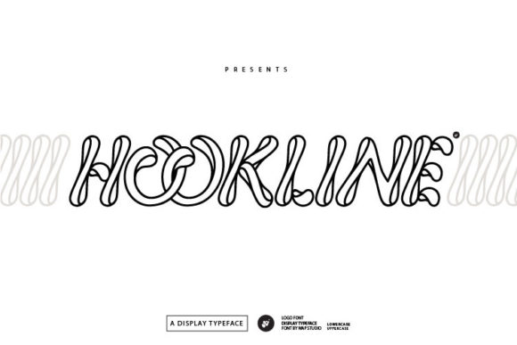
As a web designer who builds landing pages, SaaS dashboards, and conversion-focused online stores, I pay close attention to how type shapes first impressions. Hookline isn’t just another decorative font—it’s a display typeface engineered for impact without sacrificing clarity. Its clean, confident letterforms feature subtle geometric structure, balanced proportions, and a slight modern flair that reads as both approachable and intentional. It’s not a script or handwritten font; it’s a crafted display font with rhythm, spacing, and visual weight built for digital environments.
In real-world web layouts, Hookline excels where hierarchy matters most: hero section headlines, product name treatments, CTA banners, and brand-driven content sections. On a coaching website, pairing Hookline with a neutral sans serif like Inter or Manrope creates immediate contrast—Hookline carries the voice, while the supporting font handles readability at scale. For a boutique online store, it works beautifully in category headers, limited-edition campaign banners, and even subtle accent text on product cards—always used sparingly, always with purpose.
Readability is non-negotiable—even for display fonts. Hookline maintains generous x-height and open counters, which helps it hold up across devices. On mobile, I use it exclusively for short, high-impact phrases (e.g., “Launch Sale,” “New Collection,” “Join the Waitlist”) at 28–42px, never smaller. At those sizes, its letter spacing remains legible even on lower-DPI screens. Over image overlays, I apply a soft text shadow or background tint—not to mask poor contrast, but to reinforce its presence against variable content backgrounds. It performs well on both light and dark UI modes when paired with appropriate color contrast (minimum 4.5:1 for accessibility compliance).
Hookline shines in conversion-focused contexts because it communicates tone instantly. Unlike overly ornate display fonts that distract or dilute messaging, Hookline feels grounded—professional yet expressive. On a course sales page, using it for the headline (“Master Modern UI Design”) adds authority without pretension. In a portfolio site’s project title (“Brand Identity for Terra Collective”), it signals craftsmanship before the user scrolls further. It’s also effective in email subject lines rendered as web-safe fallbacks—its distinct shape translates clearly even when substituted, preserving brand recognition.
Where Hookline shouldn’t go: body copy, navigation menus, form labels, or small interface elements like tooltips or pagination. It’s not a workhorse font—and wasn’t designed to be. Its strength lies in controlled emphasis. Think of it as your typographic accent wall: powerful in isolation, supportive in context. For logos, it holds up exceptionally well at larger sizes and scales cleanly into SVG exports. Many designers use its uppercase forms for monogram treatments or combine its alternate characters (if included) for custom wordmarks—just verify your license includes access to stylistic sets.
Font pairing is where Hookline reveals its versatility. With a humanist sans serif like Lato or Nunito, it grounds creative energy in usability. With a refined serif like Cormorant Garamond, it lends editorial polish to blog headers or newsletter banners. Avoid pairing it with other display fonts—especially those sharing similar stroke contrast or rhythm—as that risks visual competition rather than harmony. Always test pairings at actual viewport sizes: what looks elegant at desktop may feel cramped on an iPhone SE.
Before implementing Hookline, check what’s included. Most premium versions offer WOFF2 files optimized for web performance, multiple weights (Light, Regular, Bold), and sometimes italics or alternates. If your project serves multilingual audiences, confirm Latin-1, Latin Extended-A, and basic diacritic support—enough for English, Spanish, French, German, and Portuguese, but likely not Cyrillic or Asian scripts. If you’re building templates for client work or digital products, ensure your license explicitly covers web embedding, SaaS usage, and resale in design assets—many commercial fonts restrict usage in white-labeled tools or downloadable themes unless upgraded.
In practice, I’ve used Hookline across six different projects this year alone: a wellness app’s onboarding flow (hero headline only), a Shopify theme for ceramic artists (collection banners + logo lockup), a B2B newsletter header (with Roboto for body), a Notion course template (section titles), a podcast landing page (episode title treatment), and a brand kit PDF (for social media graphics). Each time, it reinforced tone without slowing load times—thanks to lightweight webfont files and smart loading strategies (e.g., font-display: swap).
One final note: Hookline doesn’t replace strategy—it sharpens it. A bold headline in Hookline won’t convert if the value proposition is unclear. But when aligned with strong UX writing, thoughtful spacing, and intentional color, it becomes part of a cohesive system. That’s what makes it more than a pretty face: it supports decision-making, reinforces brand trust, and quietly guides the eye toward action—all while looking like it belongs.
If you’re evaluating display fonts for your next digital project, ask yourself: does it serve the layout—or does the layout serve it? Hookline answers that question with precision. It’s not shouting to be seen. It’s designed to be understood, remembered, and trusted—right where it matters most.